Though all of Apple’s operating systems got attention during this year’s Worldwide Developers Conference, watchOS 10 got perhaps the biggest overhaul, not only changing fundamental ways that users interact with the device, but also how information is presented on the wearable.
Some of this information was shown off during the keynote, but the WWDC session Meet watchOS 10 goes into more detail about how the Apple Watch’s design language is changing—and make no mistake, this is a major change. In many ways, the evolution of watchOS 10 feels similar to the way iOS 7 upended the way iPhone apps were designed, if somewhat less radical overall.
Interactive
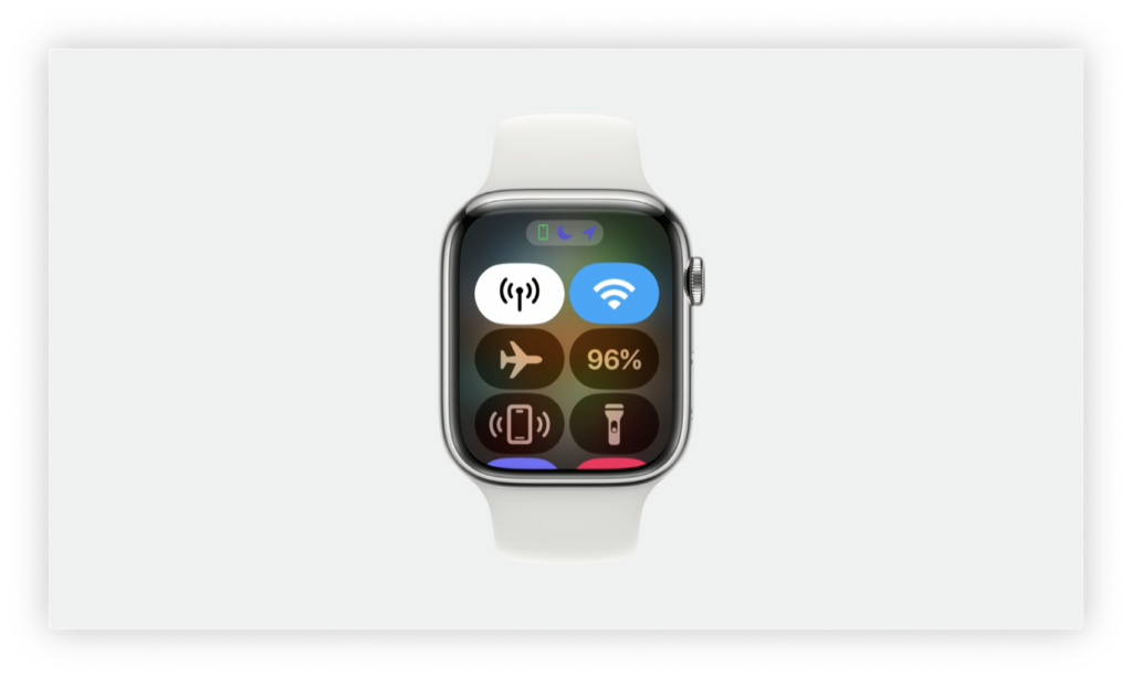
On the interaction side, Apple’s revamped both of the watch’s physical controls. The side button, which prior to watchOS 10 brings up the Dock, instead summons Control Center.
Control Center is now available anywhere with a single press of the side button.
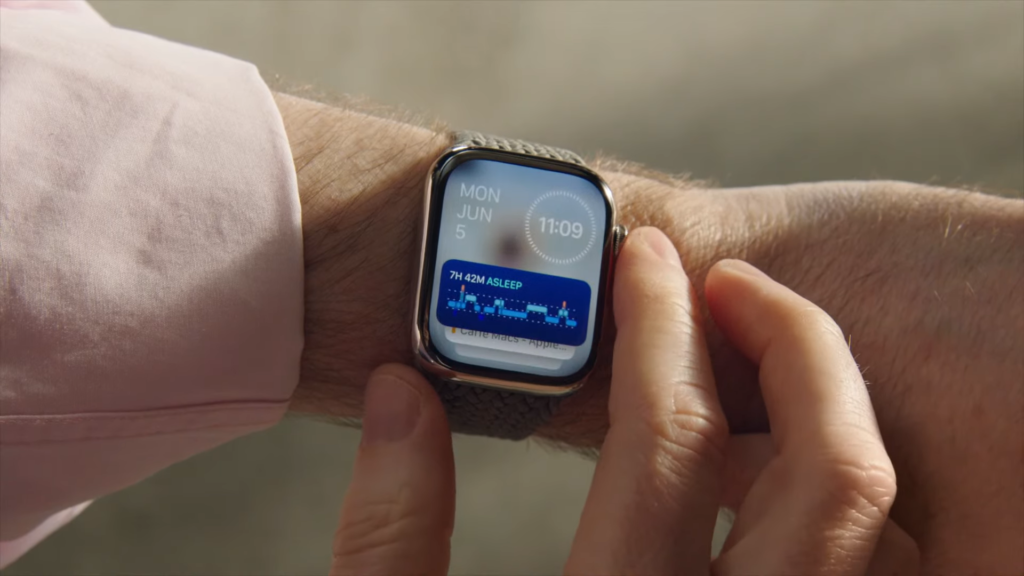
Likewise, the Digital Crown’s usage has been expanded; in previous version of watchOS 10, rotating the crown while on the watch face was limited only to interactivity within certain faces—adjusting the height of numerals on Metropolitan, for example, or letting you advance or rewind daylight on Earth in the Astronomy face. But on many faces it did nothing at all, a strange omission that left one of the device’s key tactile interactions underutilized. In watchOS 10, turning the Digital Crown while in the watch face brings up a new set of widgets.
Using the Digital Crown within apps is also now more standardized within watchOS 10. For example, you continue to be able to scroll through apps that use a list-based view—such as Mail—but in other apps with multiple screens, Apple has instituted a more rigid vertical pagination system that lets you essentially scrolls through multiple demarcated tabs rather than, say, an endless page.
It’s also worth noting that Apple has updated the increasingly unwieldy Home Screen of the Apple Watch in watchOS 10. Previous versions gave you the option of the classic Grid view1 or a List view. I’d always gravitated to the former, as frustrating as it could be, because it was easier for me to remember where something was spatially than scrolling through a lengthy list.
watchOS 10’s new home screen offers a tweaked layout.
The new Home Screen option seems to aim for the best of both worlds, providing a fixed width grid that Apple says is “consistent organization” of apps that you can scroll through with the Digital Crown.
Design
With watchOS 10, Apple’s pushing a strong change to the design language. Early rumors suggested a focus on glanceability, but what was missing from that discussion was that it wasn’t simply about redesigning the current interface, but about how Apple suggests developers design their apps.
One major way this is coming to the forefront is with three specific layouts that Apple is providing for apps: Dial, Infographic, and List. Of those, List is perhaps most similar to existing apps, like Messages and Mail, while Infographic is used in apps like the World Clock, where there’s one screen of information but you can toggle between different things like multiple locations. Dial, meanwhile, seems to take its inspiration from the watch face itself, featuring large central content with icons in the corners.
Overall, there’s a big focus on the “single page” nature of apps in watchOS, rather than apps that let you scroll through a bunch of content. Take, for example, the Activity app in the current version of watchOS. When you launch it, your activity rings are front and center, occupying the entire screen. You then have the option to both scroll down to see more information, as though you are viewing a web page, or swipe to other screens for additional information (Sharing and Awards).
In watchOS 10, those endless scrolling app pages are being discouraged. Instead, an app would present a single discrete page showing all relevant information on a single screen, and then you would page through different tabs of information. So, for example, in that Activity app, one page shows full-screen details about your Move goal, the next about your Exercise goal, and the third about your Stand goal.
watchOS 10’s redesigned Activity app uses multiple discrete screens.
Likewise, horizontal tabs, as in the current version of the Activity app, are also being phased out, since it requires you to navigate by swiping, which can obscure the display.
Apple’s also encouraging the use of background content—a color, gradient, or even animation—that conveys additional information about the current screen. Like giving a red-tint to your Move ring page, or showing the current conditions at your location in animation in the Weather app. That provides more context about what you’re looking at, and helps ground you in a particular view.
Even further reinforcing the emphasis on single page views, Apple’s discouraging the use of hierarchical navigation in watchOS 10. Which makes a lot of sense: most times when you’re interacting with your watch, you don’t want to be diving through menu after menu.2
Fundamentally, Watch interactions are measured in seconds, not minutes. The design language that Apple is encouraging in watchOS 10 seems like it will help make those interactions much more efficient when it comes to helping users see the information they want at a glance and then go back to their day.
That said, there are exceptions to the rule for apps that really need it, like Settings or Mail. ↩
[Dan Moren is the East Coast Bureau Chief of Six Colors. You can find him on Mastodon at @dmoren@zeppelin.flights or reach him by email at dan@sixcolors.com. His latest novel, the supernatural detective story All Souls Lost, is out now.]
If you appreciate articles like this one, support us by becoming a Six Colors subscriber. Subscribers get access to an exclusive podcast, members-only stories, and a special community.
Source: Read More
Author (if provided):


