Source: Read More Author:
The Apple Watch gets a major software refresh every year, and the latest is WatchOS 10, which brings app redesigns, widgets and extra tools for cyclists and hikers. The WatchOS 10 public beta is now available for all Apple Watches starting with the Series 4 and later. The beta, along with iOS 17, gives us a preview of some of the new features ahead of its general release this fall.
I used WatchOS 10 over the past few days and tried out some of the best features.
Watch this: What’s New in WatchOS 10 for Apple Watch
If you want to try it out, you need to install the iOS 17 public beta on your iPhone first, then install the WatchOS 10 beta on the Apple Watch. As with all beta software, tread carefully. Features are subject to change between now and the final release, and I strongly advise you to back up your Apple Watch and iPhone before installing. And know that you can’t revert back to WatchOS 9 if you do install the public beta.
The Apple Watch gets widgets
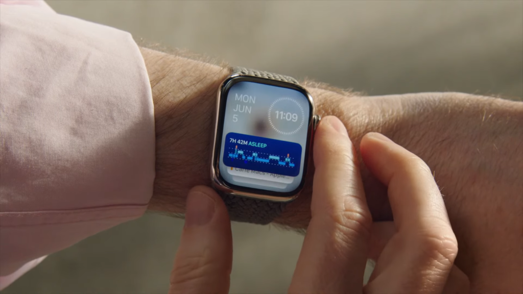
Apple has brought widget Smart Stacks from the iPhone home screen to your Watch. Smart Stacks update dynamically based on context, such as the time of day and how you use your watch. From the watch face, you simply turn the digital crown to see the Stack. You can also swipe up from the watch face.
My Smart Stack usually shows upcoming calendar appointments, the weather and my activity rings. But like the iOS home screen, you can customize the Stack even further with a long press and either removing or pinning apps.
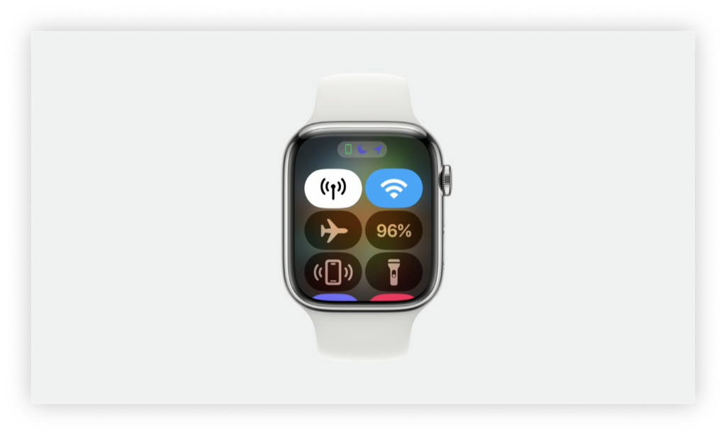
WatchOS 10 also changes how you bring up the control center. Instead of swiping up from the watch face, press the side button. This also works when you are in any app. With older versions of WatchOS, you either had to go back to the home screen, or long-press on the bottom edge of the screen when you were in another app. If you prefer the dock that comes up when you press the side button in WatchOS 9 and earlier, don’t worry. You can still access it by double-clicking the crown.
The Smart Stack in action. Screenshot by Lexy Savvides/CNET
All the stock Apple apps look better
Pretty much all of the stock apps have been redesigned to fit more information on the screen. But they also look significantly different in some cases:
Weather lets you tap through or turn the crown to see different views of air quality, wind speed, humidity and more. Activity still shows rings in the middle, but around the edge you get a weekly summary, awards and challenges. You can also swipe down to see the more granular time view of your rings’ progress.Messages can show pinned contact names and photos on first open, rather than the list of messages.Heart rate shows a new animation when reading your vitals.
One small change I really appreciate is how easy it is to switch between the Apple Watch list view and bubble app view. At the bottom of either list, you’ll see a prompt to switch to the other view. Previously you had to do a long press to switch views, or go into the Settings.
The redesigned Activity app. Apple/Screenshot by James Martin/CNET
New Apple Watch faces: Snoopy and Palette
It wouldn’t be an Apple Watch update without new faces. Snoopy and Woodstock can hang out on your wrist all day, and they have different animations depending on what you’re doing or the time of day. My favorite part of the Snoopy face is what happens when you activate the always-on display. I won’t spoil the surprise, but Snoopy reflects how I feel every day after lunch.
The Snoopy watch face doesn’t allow for complications, but if you want a new look with extra flexibility, the new Palette face is available. There are three different color layers that change depending on where the hour and second hands are located, with four slots for complications around the edge of the watch face.
Snoopy letting me know it’s too early to be working. Screenshot by Lexy Savvides/CNET
WatchOS 10 brings more tools for cyclists and hikers
Apple already added lots of useful cycling features to the Watch like e-bike calorie calculations and auto-detecting bike workouts. With WatchOS 10 your iPhone turns into a bike computer, sort of.
When you start a cycling workout on the Watch and your iPhone will automatically show a Live Activity on the lock screen. You can mount the phone to your handlebars and see all your activity metrics on the big screen, including HR zones, splits, elevation and speed. You can even mark segments, pause the workout and lock the screen controls to avoid accidental presses.
There is a live view which I find super helpful because I love to ride, but I’m not quite serious enough to need a dedicated cycling computer. This iPhone/Apple Watch combo is also much safer, because you’re not having to lift your wrist to see stats all the time. You can just quickly glance down at the phone.
I’m also excited about support for Bluetooth accessories like power meter pedals, which is big news for enthusiast and serious cyclists. To add one, go into the Settings app, tap Bluetooth and then scroll down to see a new category called Health Devices. Just like any other Bluetooth device, once the Apple Watch discovers the device you can connect. I tested this out with some power meter pedals on my stationary exercise bike and it worked seamlessly. Depending on what device you connect, your Watch will show metrics like cadence (displayed as RPM) or power (watts).
This is what it looks like when you pair power meter pedals to the Apple Watch, then use the iPhone to view the Live Activity. Lexy Savvides/CNET
I have wanted topographic maps in Apple Maps ever since I reviewed the Apple Watch Ultra, rather than relying on a third-party app. Less than a year later, WatchOS 10 supports them, and not just for the Ultra. Any Apple Watch that can run WatchOS 10 will be able to view topo maps.
Zoom in with the digital crown to see contour lines, trails, rivers and valley details. For now it’s limited to the US. You’ll also be able to find trails nearby and see their difficulty levels. Plus if you start a hiking workout, the Apple Watch will give you elevation alerts on your wrist.
Offline maps will also be available on the watch for turn-by-turn navigation and ETA, but you will need to have the connected iPhone with you. The Compass app gets a new 3D view so you can see cellular connectivity waypoints that show the last place you had a signal and SOS waypoints where you can make an emergency call.
The Compass app shows you additional waypoints. Apple/Screenshot by James Martin/CNET
Optimized charging for more Apple Watches
WatchOS 10 also lets the Apple Watch learn about your usage and decide when it is a good time to get to a full charge. This is called Optimized Charge Limit, and it was already included on the Apple Watch Ultra, but WatchOS 10 adds it to the SE, and Series 6, 7 and 8.
When this feature is active you’ll see an open charge ring appear as the Apple Watch sits on its charger. If you want to charge beyond this optimized time, tap the circle with the green or yellow charge icon, then press “Charge to full now.” This might not appear immediately, as it takes some time to learn your charging habits and will only activate when you are in certain locations where you charge the Apple Watch often, like at home or work.
These are some of my favorite new features in the WatchOS 10 public beta, but there is more to explore, including logging moods in the Mindfulness app, measuring time in daylight with the ambient light sensor, and NameDrop, which lets you share contact details when someone else’s iPhone is brought close to the Apple Watch.


