Source: Read More Author:
…and most probably the best feature ever introduced to Apple Watch
Oct 2
—
Image courtesy of the author.
watchOS 10 has recently been released — with some major changes and updates compared to watchOS 9.
But one single feature in watchOS 10 solved a lot of problems and inconveniences of the previous version. Let‘s explore.
The Problem
Have you ever set a timer on your Apple Watch via Siri and wanted to check how much time is left? It happened to me several times in the kitchen. I helped my wife prepare the lunch, she asked me to set a timer and later wanted to know how much time the meal in the oven had left. To give her an answer, I needed to go into my app library of the Apple Watch, scroll down to find the timer app, open it, and then I was finally able to answer my wife‘s question.
Another occasion: I‘m out on my bike going for a ride to close my activity rings. Back home I want to check how much of my rings is still open. What is necessary to answer this question? Yes, right — scroll through the app library, find Activity, open it, and finally get the information I was looking for.
A little faster but also not convenient at all was to let Siri open the apps to save some time scrolling through the library.
And yet another occasion: Have you ever set an alarm on your Apple Watch and wanted to check again if it‘s turned on before you go to bed? To get this information, you need to scroll through the app library…okay, I think you got the problem I‘m addressing here.
The only way to get around this? Complications. Nothing else.
Getting relevant information out of the Apple Watch apps was a pain — until the release of watchOS 10.
The solution
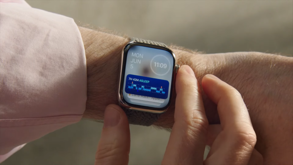
…is as simple as clever — widgets! Apple finally introduced widgets to watchOS 10 to tackle exactly this problem of getting relevant information out of the apps. An upward swipe with your finger or the digital crown now presents relevant information at a glance.
The widgets are customizable. Information that you need permanently can be added to this view and non-relevant default widgets can be removed.A simple bottom-up swipe with your finger or the digital crown now provides access to all the information that was previously hidden deeply within the system. However, this is not the ultimate feature.
It‘s getting smart
What makes the widget feature even more useful is the smart adjustment of the upmost widget. This widget displays information that is relevant to you at this specific moment.
If you have, for example, a timer running, the app icon is now displayed as a small icon on the top of the watch face. If you tap this the timer app will open. In this way, these notifications can act like a smart and temporary complication.
If an active timer is running, the Timer icon is displayed on top of the watch face. Image courtesy of the author.
Alternatively, simply swipe upwards, and the timer widget will be displayed right on top of the smart widget stack.
An upward swipe brings up the smartly arranged widgets with the Timer widget on the top. Image courtesy of the author.
This smart feature really accelerates the retraction of information from Apple Watch apps and is a huge gain in user experience.
Summary
Widgets are by far the best and most useful feature introduced to watchOS 10. The smart adjustment of the widgets makes this feature extremely convenient and even more significant. Getting information out of the Apple Watch has never been easier before. This gives you also the opportunity to keep the number of complications on the watch face low for an overall clean and minimalist look.
What is your favorite feature of watchOS 10?
Let me know your thoughts in the comments!
Thank you for reading!
Tobias
Join Medium through my referral link and read thousands of new articles every day!


