watchOS 10 brought a key feature that is game-changing.
3 hours ago
—
Image courtesy of the author.
The Apple Watch recently got some huge updates with watchOS 10. It is the first major redesign of the watchOS UI for a very long time. The best feature introduced with the new software update in September was the support for widgets. However, it was by far not the only useful feature. There is another tiny dot that is a true game changer because it solved…
An annoying issue in watchOS 9 (and older)
Let me ask you a question: How did you access active apps on watchOS 9 from the watch face? Something like an active timer or Spotify. Did you put Siri to work? Did you use the app switcher? Or did you scroll through your app library?
Well, I think these questions already make the problem clear. In watchOS 9 (and also the previous releases), it was cumbersome to get into active apps. Only Training and Now Playing were most of the time in the foreground because they were displayed on full screen. Some other apps might as well, but these two were the ones I used often. However, an active timer for instance was not. Starting from the watch face, you had to open the app switcher. From there, you can enter the app and get the required information. Although the active apps were at the top of the stack in the app switcher, it was very annoying to over and over press the side button, select the required app, tap on it, and finally get the needed information. There was no convenient way to get information from active apps in a simple one-step action.
How did I get around this issue? My method of choice was Siri. I asked Siri to open the app. This was often the fastest of all mentioned methods.
But gladly, Apple implemented some very useful changes to tackle this issue. One part of the solution is…
Widgets
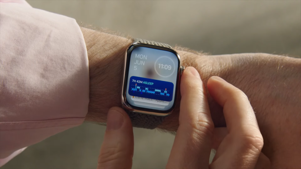
In general, with widgets, certain apps are much more easily accessible than before. It only takes a scroll of the digital crown to get quick access to relevant information or quick access to certain apps. Another great aspect of the widget stack is its intelligent arrangement. The widget that is of most relevance at a certain time will be displayed on top of the stack. And, surprisingly, this works extremely well. I never had an issue where a widget I needed was on the bottom of the stack.
However, widgets and the intelligent arrangement in the widget stack also help access active apps. For instance, an active timer or the stopwatch is displayed as a widget. In the case of these specific apps, the widgets are even interactive. But, as far as my experiences go, this feature is limited to only a few first-party apps.
Screenshots from the interactive stopwatch and timer widgets. Image courtesy of the author.
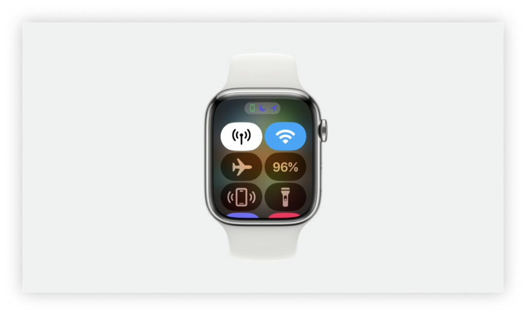
But for all the other apps (and the native apps as well), Apple introduced a tiny but game-changing dot — or as they call it…
App icons
We are already familiar with the Dynamic Island on the iPhone which is also home to active apps. In this way, we can get quick access to these apps or even get important information at a glimpse directly in Dynamic Island. But of course, the Apple Watch has too small of a display for a status and information bar like the Dynamic Island.
Anyway, Apple didn’t let us down and condensed all this to a tiny dot in the top-middle of the watch face. There is a lot to this tiny dot. It displays an icon of active apps. And, guess what, if you tap on this dot you get quick access to this particular app! It‘s as easy as that. Until watchOS 10, this dot was only present as a red dot to indicate notifications on the Apple Watch.
Since I updated to watchOS 10, I never faced the frustrating issues with opening active apps again. To complete this article, let‘s have a look at…
Supported apps
Of course, this list of apps is not exhaustive, but it gives a good overview of supported apps. And interestingly, this list of apps is even larger than the one given on Apple‘s official website.
On Apple‘s website, only five apps are named:
WorkoutWalkie TalkieApple MusicNavigation using third-party appsBacktracking (Compass)
Apps that support the app icon on the watch face according to Apple‘s official website. Screenshot taken by the author.
However, in my daily use, I also found that it works with some more apps as well:
TimerStopwatchSpotifyGoogle MapsNow PlayingApple Maps
Screenshots from the different app icons on the watch face. Image courtesy of the author.
The impact on the user experience
The app icon displayed on the watch face reduces entering active apps to a single action. With a simple tap on the app icon itself, the app opens to reveal the required information. This new feature is especially convenient to open the same active app repeatedly. This is a huge benefit for the user experience and makes interacting with the Apple Watch a lot more convenient and efficient. Besides the introduction of widgets, this might be one of the best features of watchOS 10.
Let‘s see how and if Apple takes this even further in future updates.
What is your favorite feature of watchOS 10? Let me know in the comments!
Thank you for reading!
Tobias
Source: Read More
Author (if provided):


