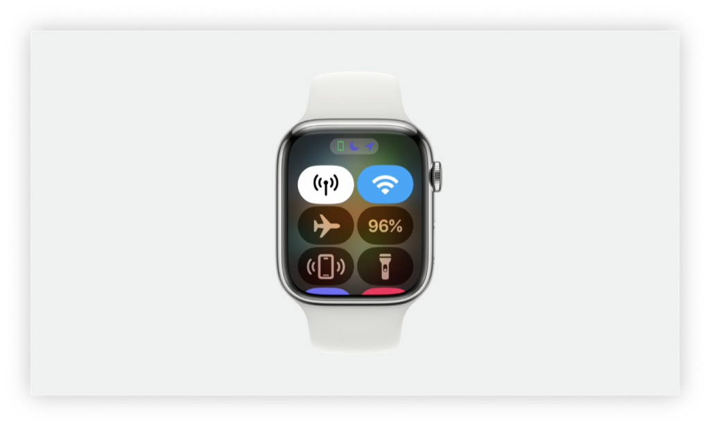
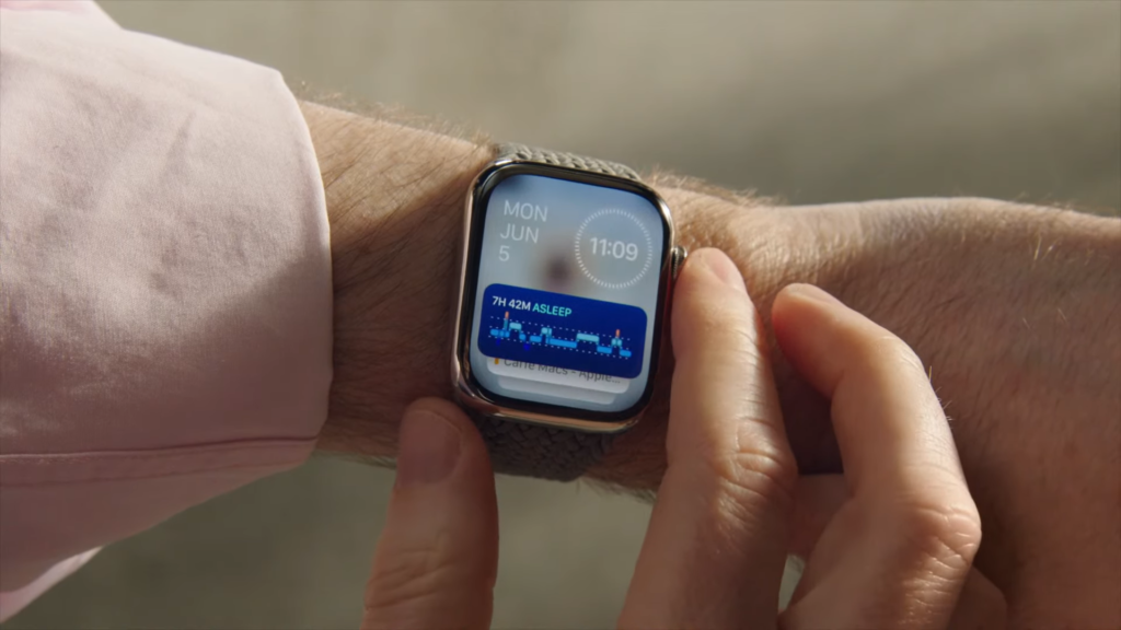
Speaker 1: This year, the iPhone, apple Watch and Mac all got some big interface changes and you may have found yourself trying to relearn how to use your device, which to me is the least enjoyable part of an operating system update. You know exactly what I’m talking about. If you have tried to text someone a photo and you got caught off guard by these giant floating circle icons, or maybe you found yourself suddenly confused on why swiping doesn’t change faces on the Apple Watch, it’s not always changed just for the sake of change. Even if the change feels pointless [00:00:30] because everything was working just fine before, usually there’s a reason for the switch that ties into some Apple Grand plan. So if you’re like me and you’re still fumbling when you find one more thing that changed in the settings, let’s chat about why certain changes were made this time around and how Apple might be trying to shift us into thinking more about augmented reality, getting us closer to a vision pro mindset.
Speaker 1: I’m Bridget Carey, and this is one more thing. The biggest change to the iPhone [00:01:00] operating system this year is standby mode. It’s where if your phone is locked and charging and simultaneously propped up to sit horizontally, then your display changes to show either the time or the weather or music that’s playing. There are a few different things it can show in standby mode. No other iOS 17 feature has truly changed my use of the iPhone than standby mode. Just making my phone into a little bedside clock won me over to the MagSafe charger life. I’m now putting MagSafe stands around [00:01:30] the house instead of playing a chord switching game between who needs a lightning cord and who needs A-U-S-B-C cord. No, just use MagSafe and slap it on a stand. This means I am using the iPhone more as a smart display around the home, so there’s less of a reason to use other smart home displays from Google or Amazon.
Speaker 1: Apple just convinced me to spend more on special stands and to spend less on devices from the competition. There’s another layer to this. Our brains might be working differently. [00:02:00] When you got iPhones displaying information just propped up around your home, it’s like having widgets just floating around in real life space and widgets are everything with Apple this year. Mac OSS Sonoma has interactive desktop widgets you can put anywhere. Same with iOS 17. You could do some actions inside of a widget without opening the app. Watch OSS 10. That’s also widget focus, so you can browse info just right on the watch face. Perhaps it’s time. We get used to little working windows of information [00:02:30] just floating all around us. Kind of like being in augmented reality where relevant info just sits in your space around you, wherever you look, be it in a Vision Pro headset or any Apple screen you own. In Iowa 17, apple blatantly put Vision Pro design elements inside of iMessage. You see, when you text someone, you used to see icons that would just take you to the camera or the photos to insert something along with other little
Speaker 2: Shortcuts above the keyboard. [00:03:00] Now it is all tucked away in a plus sign Clicking it puts very large, simple childlike circle buttons in your face and they’re just floating and blocking whatever you were doing before. You will notice the same flavor of button in the Vision Pro with simple circle icons in front of your space. It’s just waiting for you to make a decision on what app you will select. Let’s talk about Double tap on the Apple Watch. It’s another one of those changes that is a very obvious move on Apple’s part to get us thinking [00:03:30] about using our hands to control gadgets. The Apple Watch series nine and the Ultra two can be controlled with double tapping your finger and your thumb together like you’re clicking whatever the main button is on the screen, such as answering or ending a call or skipping a song.
Speaker 2: Now, the Vision Pro is also controlled with tapping fingers. The mechanics are different from the watch. The headset is using cameras to detect your finger movement. Nevertheless, this is another example of Apple getting us into thinking more about controlling devices with hand gestures, but it goes beyond [00:04:00] the Apple Watch this year. Your hands also trigger visual effects in video calls and it can get a little messy. These are called reactions. It works on FaceTime calls and even on Zoom when you’re on a Mac, the effect is on by default, which I was surprised to learn when I was doing a Zoom chat with my colleague, Scott Stein and balloons kept going off accidentally when he talked with his hands. It was the most ridiculous thing. You will get different animations [00:04:30] depending on if you put thumbs up or down or put fingers up in a certain way or make a heart shape with your hands.
Speaker 2: Apple made a mistake by having it on default because a lot of people talk with their hands like me, and a lot of people use Zoom professionally, and it’s not always a good time for party balloons as we saw happen with a live guest on ESPN who happens to talk a lot with his fingers. Look, ma party balloons. What if you’re in a video call about something sad or serious and then [00:05:00] fireworks just start going off because of how you held your hands? So yeah, controlling computers with your hands. It can be awkward, but it’s all part of the bigger plan. The last change I want to mention seems small, but it is by far my absolute favorite thing Apple did this year, and it could have a ripple effect on all future Apple software. It’s Snoopy. Snoopy on the Apple Watch, yet there was a ton of work that went into making [00:05:30] this cartoon run around your screen as a watch face. There are 148 different animations of Snoopy and Woodstock for the watch face that pops up throughout the day, and a number of animated sequences were sourced directly from Charles m Schultz’s original comic strips. Why you ask? Did Apple put so much effort into putting a Snoopy on a watch? Well, back in 2018, about five years ago, apple struck a deal to make Apple TV plus the
Speaker 3: Home of Peanuts content. Not just the holiday specials, [00:06:00] but new shows like Snoopy and Space and the Snoopy Show, and Apple just announced there’s going to be a new Peanuts movie starting production in 2024, starring Snoopy and Charlie Brown. Yeah, notice Snoopy gets the top billing, but this Snoopy face has done something very interesting in my home. My 4-year-old loves seeing what Snoopy is doing on Mommy’s watch, and now he gets excited when he sees Snoopy anywhere in the world, and you could bet that I’m going to want to watch more Snoopy content with my son and keep that Apple TV [00:06:30] plus subscription going all because I have this silly cartoon doggy that’s always hanging out with me. Is this the ultimate dream for media companies and their intellectual property in Disney’s video pitch for the Vision Pro? Remember that they showed Mickey Mouse hopping around your living room.
Speaker 3: I would not be surprised if we eventually see Snoopy and Woodstock just chilling out on your desk while you work in Vision Pro doing their thing floating in space. Yeah, media icons suddenly [00:07:00] just live inside your everyday world beside you in all screens and mediums. The future is maximum Snoop. I want to hear what changes is from Apple rocked your world this year and what you’re wishing to see for next year. I’ll be highlighting some of them in future episodes, so please subscribe because I don’t have my own widget to remind you to watch me here on Fridays. Thanks and catch you next week.
Source: Read More
Author (if provided):


