I was excited to get a bunch of new Apple Watch features after downloading WatchOS 10. But instead of celebrating the new widgets and watch faces, I discovered that Apple made a major change that rendered my first-generation Apple Watch SE nearly useless.
After downloading WatchOS 10, a tutorial popped up on the SE’s screen that required me to double-tap the side button, which I rarely use. However, when I tried to double-tap it, nothing happened. The button didn’t appear to move, and the screen didn’t acknowledge my taps. I attempted to clear out of the tutorial by pressing the Digital Crown a few times, but the message stayed stubbornly on the screen. I attempted to double-press again to no avail.
That’s when I realized that my Apple Watch was broken. The side button was stuck. And it’s possible that it’s been broken for months.
But until this change came with WatchOS 10, I didn’t even need to use the side button to access everything I wanted on the Apple Watch. Why is it that with one update, I went from feeling perfectly happy with how my Apple Watch works to suddenly feeling like my device has been ruined? And I imagine for people who otherwise have a functioning watch, this change could disrupt established habits.
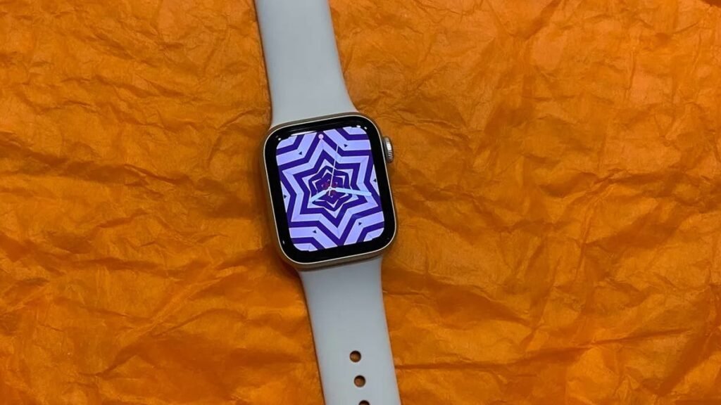
The side button on my Apple Watch SE, which no longer functions. Mike Sorrentino/CNET
What is the Apple Watch’s side button, and why does it matter?
The Apple Watch’s side button — not to be confused with the Action button on the Apple Watch Ultra and Ultra 2 — is next to the Digital Crown. It’s easy to miss because it’s flush with the side. The button had two purposes over the years, both of which I never needed. You can tap it once to swap between apps or press and hold the button to turn the watch off.
While the previous intended function was a nice thought, the fact is, beyond workout tracking, I don’t regularly swap between apps. The most multitasking I ever do on the Apple Watch is perhaps responding to a text notification while switching between GPS directions or music controls — all of which the Apple Watch itself used to breeze through without a dedicated multitasking menu. On the rare occasion when I fully powered down the Apple Watch, I used the settings menu.
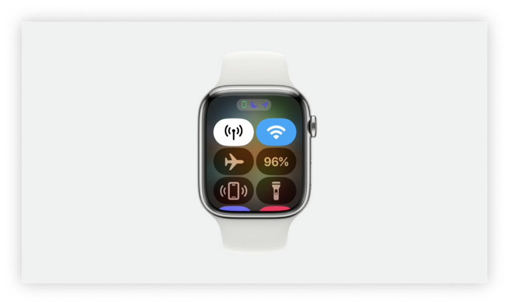
But with WatchOS 10, Apple shifted the Control Center over to the side button, and there’s currently no way to remap it to anything else. The Control Center is filled with quick tools that I use all the time, such as Do Not Disturb, Airplane Mode and Theater Mode. Previously, you navigated to the Control Center by swiping up from the bottom of the screen. But in WatchOS 10, that gesture has been moved to the new Smart Stacks widget list. These are essential tools for when I need to quiet my phone before going to a movie theater or when boarding an airplane. But WatchOS 10 changes that and moves them to the side button, which on my SE was broken. In other words, my Apple Watch couldn’t access any of them.
I’m not the only one critical of WatchOS 10’s side button changes, and I’ve reached out to Apple asking for comment about that button. Last summer Bloomberg’s Mark Gurman noticed the move in the WatchOS 10 beta and described it as Apple “wasting a button” when the side button could instead take on a custom function.
Bloomberg’s Mark Gurman on the Apple Watch side button. Screenshot of Twitter/X
During my research for this story, I came across other social media posts from people discovering that the side button‘s new functionality didn’t make sense for the control center. There were other people who also hadn’t needed the side button button but now are forced to add it to their routine.
Screenshot of Twitter/X
Screenshot of Twitter/X
Screenshot of Twitter/X
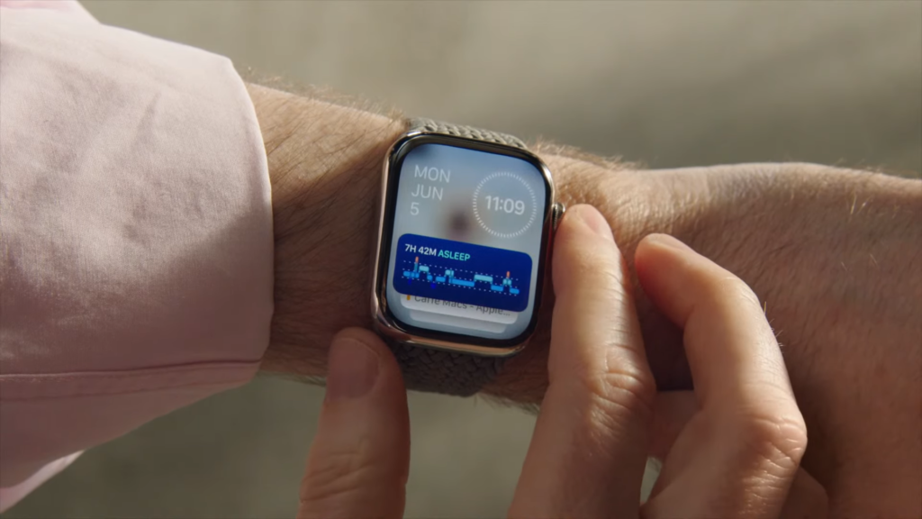
Moving the Control Center to the side button opened up Apple to reassign what swiping up from the bottom of the screen does. In WatchOS 10, a swipe up on the touchscreen or a swipe up on the Digital Crown lets you access a new widget-filled Smart Stack list. But Apple could have assigned the Smart Stack list to just the crown, allowing the Control Center to remain available with a swipe on the screen.
What Apple should do with the side button
I’m hopeful that future WatchOS updates will improve the side button. It’s entirely a software choice that’s limiting it to accessing the Control Center. It’d be fantastic if Apple could make it a customizable feature like the Action button that’s available on the $799 Apple Watch Ultra 2.
While I already use display complications for fast access to workout tracking, it would be excellent if I could press a button to start a workout. For now it seems like Apple limits that convenience to high-end devices like the Ultra and Ultra 2. For instance, on the Ultra 2 you can program Shortcuts to the Action button, which allow for a number of customizable possibilities.
The Apple Watch Series 9. Lisa Eadicicco/CNET
I replaced my Apple Watch so I can use the side button, but I was lucky…
My Apple Watch is still covered under an AppleCare plan, but only because I paid to extend it past two years. My initial two-year $59 AppleCare plan expired in June, but I’m trying to get four years out of my Apple Watch before replacing it. I decided to pay the $2.71 a month to keep AppleCare going. That $70 investment paid off, as without the plan an out-of-warranty replacement of my Apple Watch SE would have been $249 — basically the cost of a new watch. Instead, I paid nothing additional since it counted as an equipment malfunction covered under AppleCare.
But Apple doesn’t offer much flexibility otherwise when it comes to Apple Watch repairs. My colleague David Lumb discovered that his Apple Watch Series 5 wasn’t repairable when several sensors inside of it became damaged after four years of regular use. However, Apple quoted him a repair cost of $390 with taxes and fees in order to replace his watch’s internal assembly, which is very close to the cost of buying a new Apple Watch Series 9. Instead he’s now using the watch without the fitness-tracking features those sensors provided, because replacing the watch at that cost doesn’t make sense.
During my calls with Apple customer support, the representative I spoke to noted that unlike with the iPhone — which can be repaired at Apple store locations with varying repair costs depending on the damage — most Apple Watch repairs are more complicated and require a full Apple Watch replacement. The only exception are Apple Watch battery swaps.
Thanks to having AppleCare, I was able to get a replacement watch two days later using Apple’s Express Replacement Service. I mailed off my broken Apple Watch using the same box the replacement arrived in. But if I didn’t have AppleCare and was confronted with the $249 replacement cost, I’d be pretty irate that there wasn’t a cheaper price to just fix a button.
It’s totally fine to avoid WatchOS 10, and I probably should have skipped it
This isn’t the first time I’ve had issues with an Apple software update related to the Control Center. Back in 2016, I intentionally skipped updating my iPhone SE to iOS 10 because I didn’t like how Apple made the Control Center a convoluted mess that required scrolling through various pages to get all of the necessary tools. Those issues were resolved a year later in iOS 11, but until then I stubbornly ignored all of Apple’s prompts to update. In more recent years, though, Apple hasn’t been mandating its users to download these major software updates, and continues to provide important security updates to devices that haven’t yet updated to WatchOS 10.
If I knew that using WatchOS 10 would require a full Apple Watch replacement, I would have delayed downloading the update for as long as possible. Unfortunately there is no option to roll back to WatchOS 9 after making the update to 10. While I’m glad I was able to get the device replaced for free to alleviate the issue, I hope Apple’s next software update brings better customization options so that its customers can navigate the watch’s features the way we want to.
Source: Read More Author:


