watchOS 10 rethinks how you’ll interact with the Apple Watch — and would ya look at that, Apple finally did something about the app grid.
If you buy something from a Verge link, Vox Media may earn a commission. See our ethics statement.
Over the years, I’ve developed a certain muscle memory with the Apple Watch. I don’t have to think about how to access my notifications or the app grid or switch through my watchfaces. I just do it. All that’s flown out the window with the watchOS 10 developer beta. As it turns out, watchOS 10 would like me to do things differently — and to my surprise, I’m not mad about it.
As to why Apple up and decided to change things, the short answer is widgets.
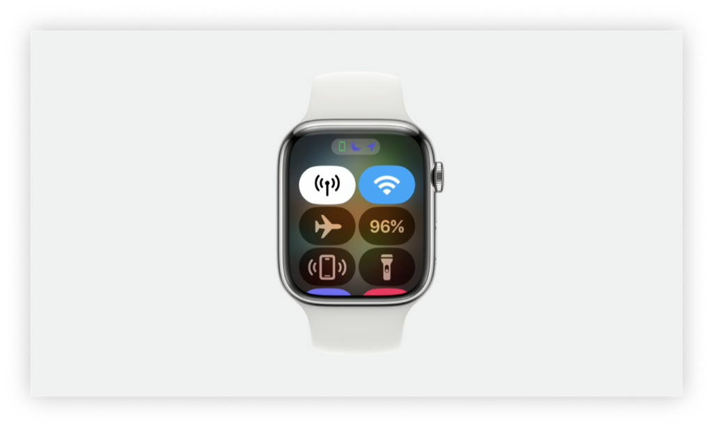
Widgets — or Glances, as Apple called them — used to be a thing in the early days of the Apple Watch but were phased out in favor of complications and a more app-centric interface. But they’re back in full force in watchOS 10, and reintroducing them is like setting off a bunch of dominoes. Where I used to swipe up for Control Center, it now brings up widgets. I now have to press the side button if I want Control Center. Apps have a new look, and a side effect is that I use the digital crown a lot more than I used to. And so on and so forth.
I wasn’t sure how I’d felt about this when Apple previewed watchOS 10 at WWDC last month. On the surface, it didn’t seem like a “milestone” change — at least not in the way that the Apple Watch Ultra was for the entire lineup. But after a few weeks with watchOS 10, I have noticed a change in the way I interact with and think about my Apple Watch.
Widgets are good, actually
I’m a data gal. When I look at my watch, I want to know things beyond the time. Before a run, I want to flick my wrist and see the temperature so I know whether to carry a water bottle. I also want to access things quickly. I don’t want to scroll through a list of apps (or an unwieldy honeycomb grid) just to set a timer, and I’d rather not talk to Siri.
For me, that means I default to using complication-heavy watchfaces like Modular or Modular Duo. It’s a utilitarian choice, but it’s not as aesthetically pleasing as more minimal watchfaces like Typograph, Portraits, or California. That’s where widgets come in.
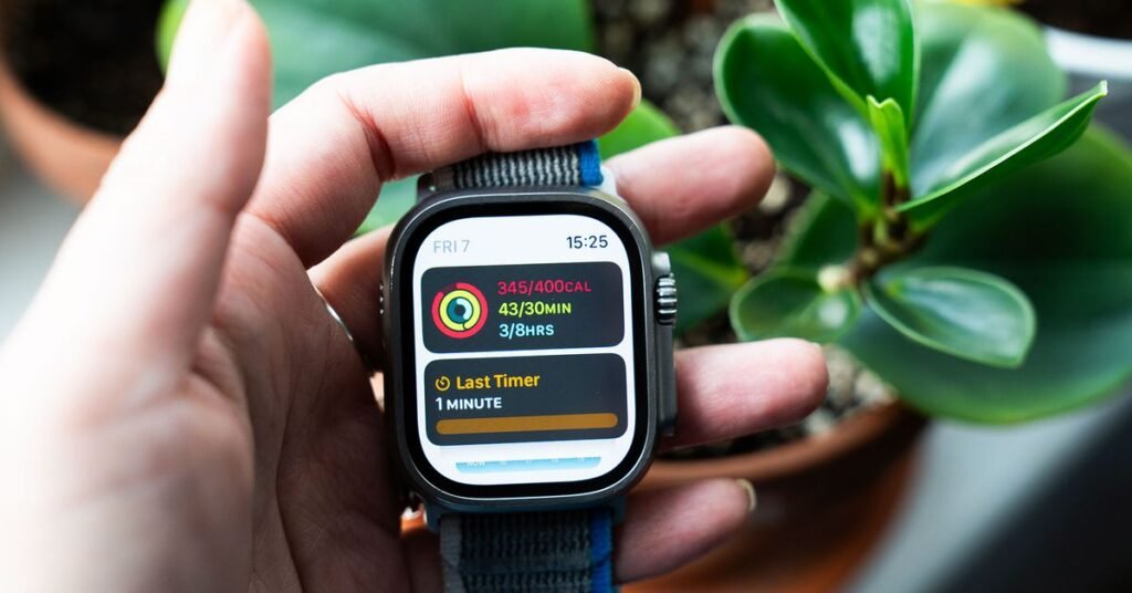
All I have to do is swipe up, and then voilà — I’ve summoned a list of widgets featuring my most commonly used apps. They’re there regardless of which watchface I choose, which gives me more options in how I customize the Apple Watch to best fit my needs. Say I want a distraction-free watchface for my Work Focus, but I don’t want to sacrifice the ability to quickly see how far I am on my Activity Rings. With widgets, I don’t have to sit down, scratch my head, and do multidimensional calculus to figure out which minimalistic watchface will afford me that.
The widgets themselves can smoosh in quite a bit of information that a teeny complication often can’t. For instance, I could use the new Palette watchface and still swipe up to see the temperature for the next five hours. If I need to see more, I can tap that widget, and it brings up a redesigned Weather app that displays the information much more prominently. (More on the new app designs below.)
Without trying it yourself, it’s hard to grasp why this is different from a complication. What I think it boils down to is flexibility and overall speed. You can absorb so much in an instant from a well-designed graphic. It’s like how scanning a block of text in a logographic language, like Chinese or Japanese, is faster than doing the same in English.
Not all widgets and complications are created equal
It’s not perfect. Not all widgets and complications are created equal. The Weather app, for example, is much more useful as a widget than a complication. The opposite is true for the Timer app — the complication is faster. On the Ultra, there’s no beating the Action Button to launch the Workout app. As for the Activity app, it’s a toss-up between widgets and complications depending on which watchface you’re using. The point is that widgets allow you to use aesthetic watchfaces with greater flexibility, especially if you like programming specific watchfaces for Focus modes.
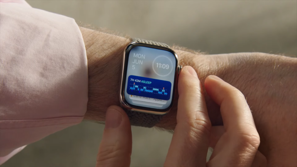
This concept isn’t unique to the Apple Watch. Wear OS watches have had Tiles for ages, and they essentially do the same thing. The main difference functionally is it’s much easier to cycle through every single widget on the Apple Watch. They’re more space-efficient, and it’s faster to scroll vertically than horizontally, as Wear OS has you do. The other thing Apple has is the Smart Stack. What’s “smart” about it is that in the list of widgets you’ve just built, watchOS 10 will use machine learning to surface the most relevant widgets first based on contextual clues. So Weather and News might pop up first in the morning, while Calendar might take that top slot in the hour before your next meeting. It’s subtle, and sometimes the AI doesn’t get it right — but you can flip through the widgets fast enough that it’s not a glaring problem.
For now, you’re limited to widgets for Apple’s native apps. I imagine it’ll be much more fun and customizable when third-party app developers start coming out with their own widgets. Hopefully, it also encourages developers to get creative with Apple Watch apps as well.
The only downside is as I learn how to incorporate widgets on the watch, I’m constantly messing up the controls. I’ve almost a decade of Apple Watch muscle memory that I’ve got to reprogram. Listen, I’m a fan of using the side button to launch Control Center, but it’ll be a hot minute before I do it right every single time. This won’t be a problem for everyone. Many of y’all will adapt much faster than I have, and new users won’t know the difference.
Apps and the app grid
To accommodate widgets, all of Apple’s native apps have gotten a makeover. Overall, everything is more readable, animations are slicker, in-app navigation is more intuitive, and for the most part, there’s less scrolling. It feels like I’m actually using a mini phone app instead of using a fiddly adaptation drawn from memory.
1/3
Some redesigns are more comprehensive than others. The Workout app, for instance, is pretty much the same, except the text is bolder and you can specify preferences for each activity on the wrist. The Weather and Activity apps, however, are totally different beasts. The Weather app is my favorite redesign of the bunch. It’s not only more vibrant to look at — the way information is presented is super digestible at a glance. The way the Weather app is now, it’s like one big long screen that you scroll through to find the info you want. In watchOS 10, instead of scrolling down for a zillion years to find the chance of rain, you just tap the upper-right icon and select Precipitation — and there it is in big honking numbers. If I want to seethe forecast for the next 12 hours, I just swipe up once. It differs from app to app, but it’s generally easier to switch between screens with minimal taps, scrolling, and swipes.
Again, this is something where we’ll have to see how developers redesign their apps. I imagine some will do it with aplomb while others will fumble. For now, I’m optimistic more developers will get it right than not.
But perhaps the best app-related change is the grid. That godforsaken honeycomb grid where you have to pinch and zoom, cursing under your breath while you look for that one app with the logo you can’t remember, is no more. Instead, it’s a grid / list hybrid. You still get the logos, but they scroll in a more orderly list fashion. (Samsung Galaxy Watch users will know what I’m talking about.) I weep at the beauty of it. I’ve edited the grid view so that my most frequently used apps are front and center, with less frequently used apps lower down. You can’t do this with the regular list format, which is strictly alphabetical. (I hate hate hate scrolling all the way down to S for settings or T for timer.) Jiggle mode is still a pain on such a tiny screen, but it’s worth it.
Fitness and feeling ‘slightly unpleasant’
I’ll be upfront. The biggest fitness updates this year are for cyclists, and I’m a public safety hazard on any non-stationary bike. So I can’t comment on how well these new cycling features work, though I am looking to rope in a colleague who does cycle to give a more informed opinion.
Similarly, I haven’t had the chance to go hiking and try out the new mapping features in watchOS 10. Yet. I’ll be tackling Acadia National Park this month and will report back once I’ve gotten to test these features in an organic setting.
That said, the Fitness Plus app has gotten a few meaningful updates. I get easily overwhelmed when trying to decide which class I want to take, but you can now program custom workout plans. So if I want to focus on my core on non-run days, I can tell the app I want core, pilates, and yoga workouts on Tuesdays and Thursdays for the next four weeks, totaling 30 minutes, and specify which instructors I prefer. On Tuesdays, I’ll then get a notification, and when I pop open the app, I’ll see a class lineup totaling 30 minutes. Likewise, you can also create Stacks — or workout class playlists. So if I want to do 10 minutes of strength, 10 minutes of core, and a 10-minute cooldown, I can queue them up and let them play automatically. These are teeny updates, but anything that reduces friction when building an exercise habit gets a thumbs up from me.
On the health side of things, watchOS 10 introduces mood logging. If that’s your thing, then this is a built-in way to take note of why you feel “very unpleasant, unpleasant, slightly unpleasant, neutral, slightly pleasant, pleasant, or very pleasant.” There are abstract shapes! You get reminders like you would breathing reminders! You can also add extra context about what’s causing you to feel a certain way, and over time, you’ll get some contextualization in the Health app.
It’s fine. I don’t love it, but most of the Mindfulness app features aren’t my thing. (Though the meditations in Fitness Plus are pleasant!) I’m not saying there’s no inherent value. Mental health is still very much stigmatized, and these are basic, accessible, and discreet tools to get started. Emphasis on basic. For instance, I’m much further along in my mental health treatment — I know what works for me, and enabling more reminders to log my emotions ain’t it. The same goes for the depression and anxiety assessment tests. To me, these features are like crawling before you take baby steps toward therapy. They’re not a replacement for proper mental health care, nor are they designed to be.
Other notes and observations
Photography by Victoria Song / The Verge
Source: Read More Author:


