This year the iPhone, Apple Watch and Mac all got big interface changes. You may have found yourself relearning how to use your device which, to me, is the least enjoyable part of a software update.
If you found yourself suddenly confused as to why swiping doesn’t change Apple Watch faces or if you’ve tried to text someone a photo from your iPhone and got caught off guard by the new iOS 17 giant floating circle icons, you’ll know what I mean.
It’s not always “change” just for the sake of change, even if the change feels pointless, because everything was working just fine before. There’s usually a reason for Apple switching things up or how they work that ties into its grand plan — which may be shifting us to think more about augmented reality.
WatchOS 10 and iOS 17 are getting our Apple Watches, iPhones and, most importantly, us closer to a Vision Pro mindset.
StandBy mode conditioning
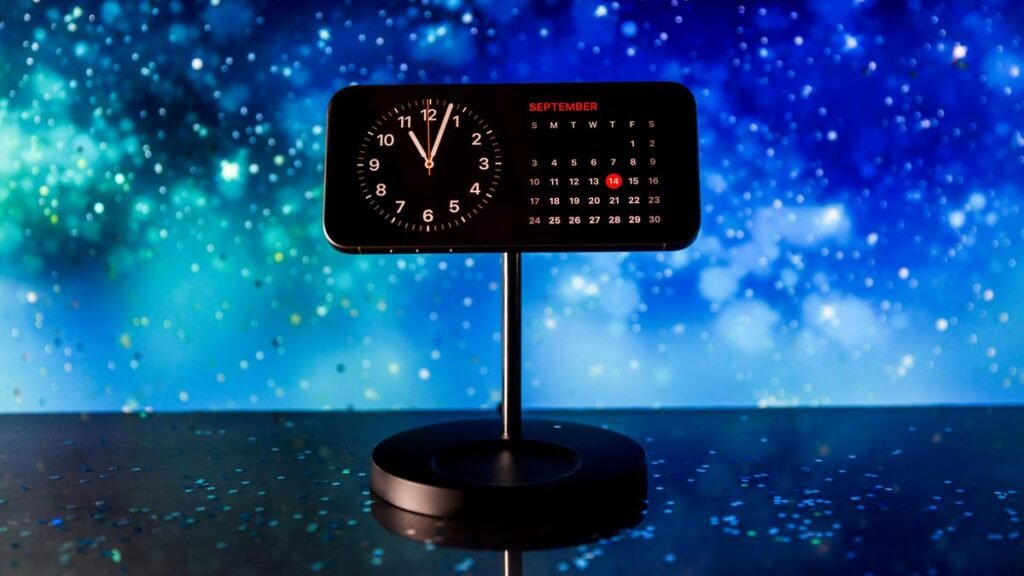
This year the biggest change to the iPhone’s operating system was StandBy mode. If your phone is locked, charging and propped up horizontally, your display changes to show either the time, weather, photos, widgets or music that is playing. StandBy mode has a few different views and some minor customizations.
iOS 17 turns the iPhone into a mini smart home display. Patrick Holland/CNET
No other iOS 17 feature changed the way I use the iPhone more than StandBy mode. Just being able to make my phone into a little bedside clock has me living that MagSafe charger life. I now have MagSafe stands around the house instead of having to play the ol’ “searching for the right charging cord” game. Who needs a Lightning cable or USB-C cord when you can just slap your iPhone onto a MagSafe stand?
Read more: Best Wireless Charger of 2023
As a result, I use my phone more as a smart display around my home so there’s less reason to use other smart home displays from Google or Amazon. Apple convinced me to spend more on special magnetic charging stands, and use its competitors’ devices less.
But there’s another layer to this. Our brains might be working differently because we’ve got iPhones displaying info propped up around our homes. It’s like having widgets floating around in our real life space.
The newest Mac software update allows you to use Widgets anywhere on your computer. Apple
Widget-washing our brains
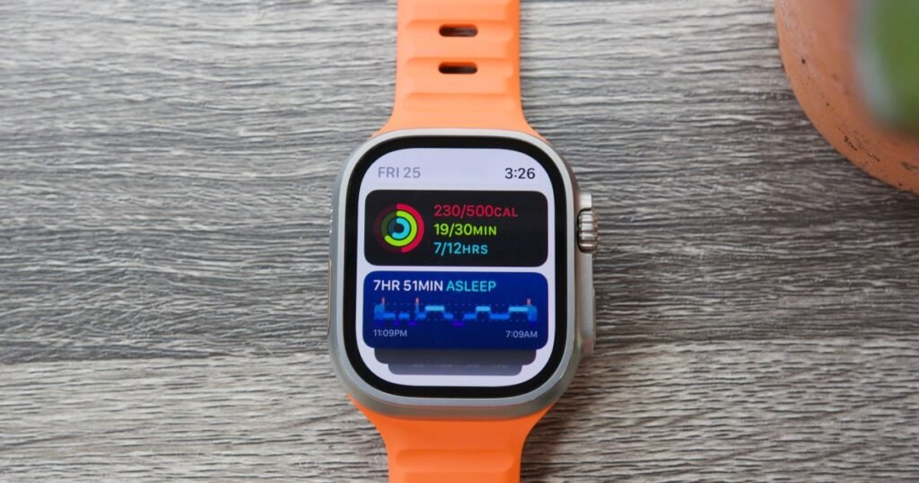
This year, Apple added widgets everywhere. MacOS Sonoma has interactive desktop widgets you can put anywhere on the screen. In iOS 17, you can interact with a home screen widget without opening the app. WatchOS 10 brings widgets to your watch face to glance at info.
Getting used to working with tiny windows of information floating all around you is like being in augmented reality, where relevant info sits in your space around you. Wherever you look, your Apple screen has widgets. And soon you won’t need a screen in order to have widgets in your field of vision. Soon you’ll just be able to use the Vision Pro.
In iOS 17 iMessage apps which will no longer live above your keyboard. Apple
iMessage has child-like Vision Pro buttons
With iOS 17, Apple blatantly put some of the Vision Pro’s software design into iMessage. When you text someone, there used to be a tray of icons above the keyboard. There were icons to open the camera to take a picture, to add photos, insert GIFs, along with other shortcuts.
A list of apps as they would appear inside of the Apple Vision Pro headset. Apple
Now it’s all tucked away into a plus sign on the bottom left side of the screen. Clicking it brings up a simple bulleted list of really big circle buttons. They’re in your face, floating and blocking whatever you were doing before.
The Vision Pro has this same flavor of child-like circular icons in front of your space. They wait there for you to make a decision on what app you’ll select.
Apple/GIF by Arielle Burton/CNET
Steve Jobs: ‘God gave us 10 styluses. Let’s not invent another’
Double Tap on the Apple Watch is another move on Apple’s part to get us thinking in a Vision Pro mindset. The Apple Watch Series 9 and the Ultra 2 can be controlled with double tapping your finger and thumb together, like you’re tapping whatever the main button is on the screen, such as answering or ending a call, or skipping a song.
The Vision Pro is also controlled by tapping your fingers. The mechanics are different from the watch, as the headset uses cameras to detect your finger movement. But, nevertheless, Apple is getting us to think more about controlling devices with hand gestures. And this hand control push goes beyond the Apple Watch.
This year, your hands could trigger visual effects in video calls. Apple calls these Reactions. They work on FaceTime calls and even Zoom calls when you’re on a Mac. The effect is on by default — which I was surprised to learn when I was on a Zoom chat with my colleague, Scott Stein. Animated balloons kept going off accidentally across the screen when he talked with his hands, and it was the most ridiculous thing.
You get different animations depending on how you hold up different fingers and thumbs, or if you make a heart shape with your hands.
Apple made a mistake by having it on by default because a lot of people talk with their hands. A lot of people use Zoom professionally, and it’s not always a good time for party balloons to appear on screen, as we saw happen to an ESPN commentator during a live video chat who happens to talk a lot with his fingers.
But yeah, controlling computers with your hands: It can be awkward, but it’s all part of the bigger plan.
Snoopy is everywhere. Apple/Screenshot by CNET
Using Snoopy as a gateway drug
My absolute favorite thing that Apple did this year was Snoopy.
Snoopy is on the Apple Watch. There was a ton of work that went into making this cartoon run around your screen. Apple made 148 different animations of Snoopy and Woodstock for the watch face that can pop up throughout the day. There’s also a number of animated sequences that were sourced directly from Charles M. Schulz’s original Peanuts comic strips.
Why, you might ask, did Apple put so much effort into putting Snoopy on its watch? Back in 2018, Apple struck a deal to make Apple TV Plus the home of Peanuts content. And it’s not just the holiday specials. There are new shows like Snoopy in Space and The Snoopy Show. Apple just announced there will be a new Peanuts movie starting production in 2024 starring Snoopy and Charlie Brown. (Snoopy gets top billing.)
But this Snoopy watch face has done something very interesting in my home. My 4-year-old loves seeing what Snoopy is doing on mommy’s watch. And now he gets excited whenever he sees Snoopy anywhere. You can bet now that I’m going to watch more Snoopy content with my son and keep that Apple TV Plus subscription going, all because I have this silly cartoon doggie always hanging out with me. Good grief!
Is this the ultimate dream for media companies and their intellectual property? In Disney’s video pitch for the Vision Pro, it showed Mickey Mouse hopping around someone’s living room. I wouldn’t be surprised if we eventually see Snoopy and Woodstock chilling on your desk in Vision Pro. They’re just doing their thing, floating in your space. Media icons suddenly just live inside your everyday world, beside you in all screens and mediums. The future is maximum Snoop.
CNET’s Patrick Holland contributed to this story.
Source: Read More
Author (if provided):


